Galvia
Brand identity guidelines and visual assets
This webpage provides guidance for creating consistent and recogniseable visual communications on behalf of Galvia. From here you can download the artwork assets and communications templates you need, in a range of file formats, with guidelines for preferred use.
Brand
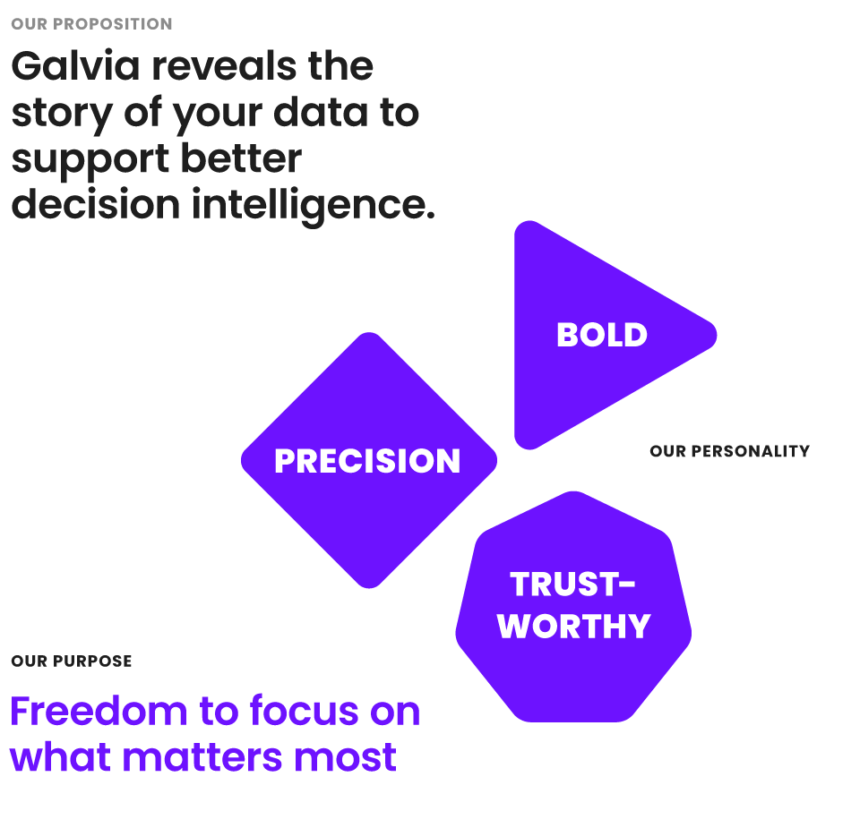
Our brand is our reputation and we maintain our brand in our manner of expression: how we speak, how we think and how we behave. If we are to build a positive reputation, it is important that we are guided by our brand principles, when interacting with our clients. We have defined the three pillars of our brand:
Our Proposition
Galvia reveals the story of your data to support better decision intelligence.
Our Personality
- Precision: Absolute accuracy and detail in our execution (how we do things).
- Trustworthy: We listen attentively and we care about your success (how we come across).
- Bold: We are not afraid to push and constantly question everything, always adapting while we strive to improve (is how it feels to work with us).
Our Purpose
Freedom to focus on what matters most.
Logo
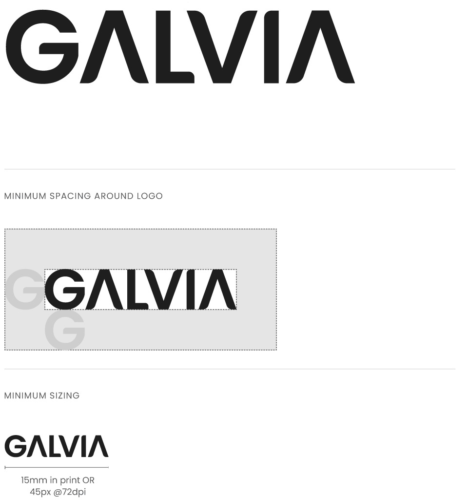
Our logotype is a stylised visual treatment of our name, where the cross bars of the letter 'A' have been removed - to create an upward and down ward movement in conjunction with the letter 'V'. It is available to download in a range of file formats.
When using the logo, please keep the following principles in mind:
- Only use original artwork. Don't re-draw, re-colour or stretch the logo.
- Minimum spacing: Allow ample space around the logo as illustrated here. The minimum clearance space around the logo should be the height and width of the letter 'G' from the word 'Galvia'.
- Sizing: Ensure it is clear and legible. Reproduction below the minimum sizing will result in illegibility.
Avatar
An avatar is a distilled version of our logo - for application across our social media profiles. Our avatar is the letter 'G' from our name - which can be themed throughout the year to reflect an occasion or celebration. It is available to download in a range of file formats.
Get our avatarColour
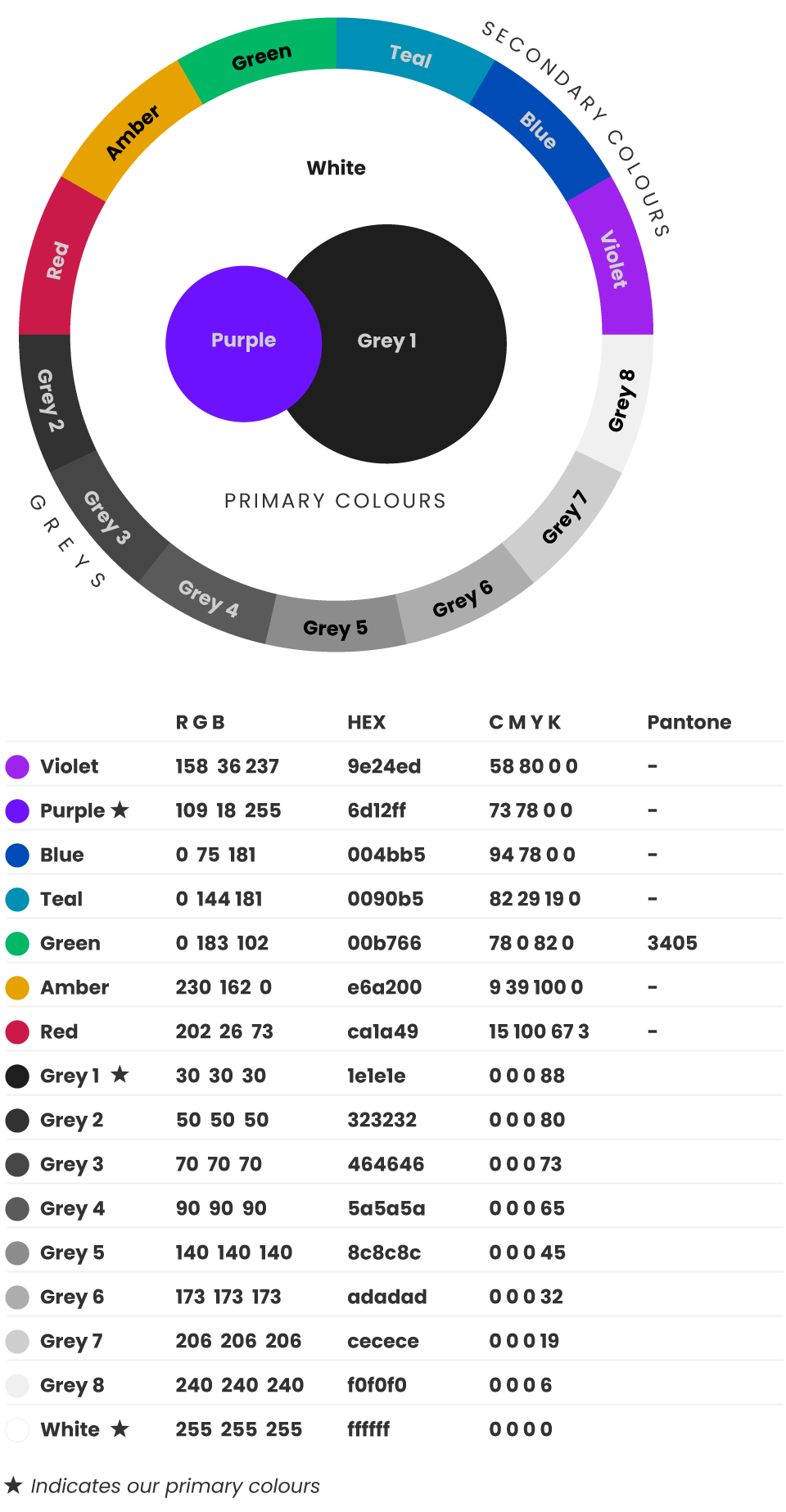
We have a primary, secondary and grey colour palette. All full colour communications must prioritise our primary colour palette. Our secondary palette is used to support any complex messages (eg red, amber and green can be used to indicate status). We recommend that you use our secondary and grey palettes sparingly, only ever using a maximuum of 3 additional colours to our primary palette.
When selecting colour, please keep the following principles in mind:
- Start with our primary colour palette. The coverage ratios indicated in our colour circle should be noted.
- Combine multiple colours sparingly. To avoid a rainbow effect, we recommend combining our primary palette with no more than 3 other greys and/or 3 secondary colours in any one design.
- Light theme. Generous use of white space is preferred.
Colour HEX values
- Violet #9e24ed
- Purple #6d12ff
- Blue #004bb5
- Teal #0090b5
- Green #00b766
- Amber #e6a200
- Red #ca1a49
- Grey 1 #1e1e1e
- Grey 2 #323232
- Grey 3 #464646
- Grey 4 #5a5a5a
- Grey 5 #8c8c8c
- Grey 6 #adadad
- Grey 7 #cecece
- Grey 8 #f0f0f0

Typography
Primary typeface
'Poppins' is our preferred typeface. It comes in a range of weights, to suit printed or digital use. Its elegant geometric forms are contemporary in style with good legibility at small sizes.
Get PoppinsFall-back typeface
For situations where you cannot access the 'Poppins' typeface, or where there is a remote possibility that the end-user might not have 'Poppins' installed on their device, we suggest you use 'Arial' in place of 'Poppins'. This is key when sharing Microsoft Office files such as Word, Powerpoint or Excel, or for certain digital commuications such as email, where web fonts are not universally compatible.
Hero images
These photo portraits express the Galvia experience from our users' perspective. They convey the joy experienced as a consequence of our purpose: 'Freedom to focus on what matters most'. Photo subjects are captured in black and white reportage style, with naturalistic expressions and joyfully focussed on their work.
Get our hero images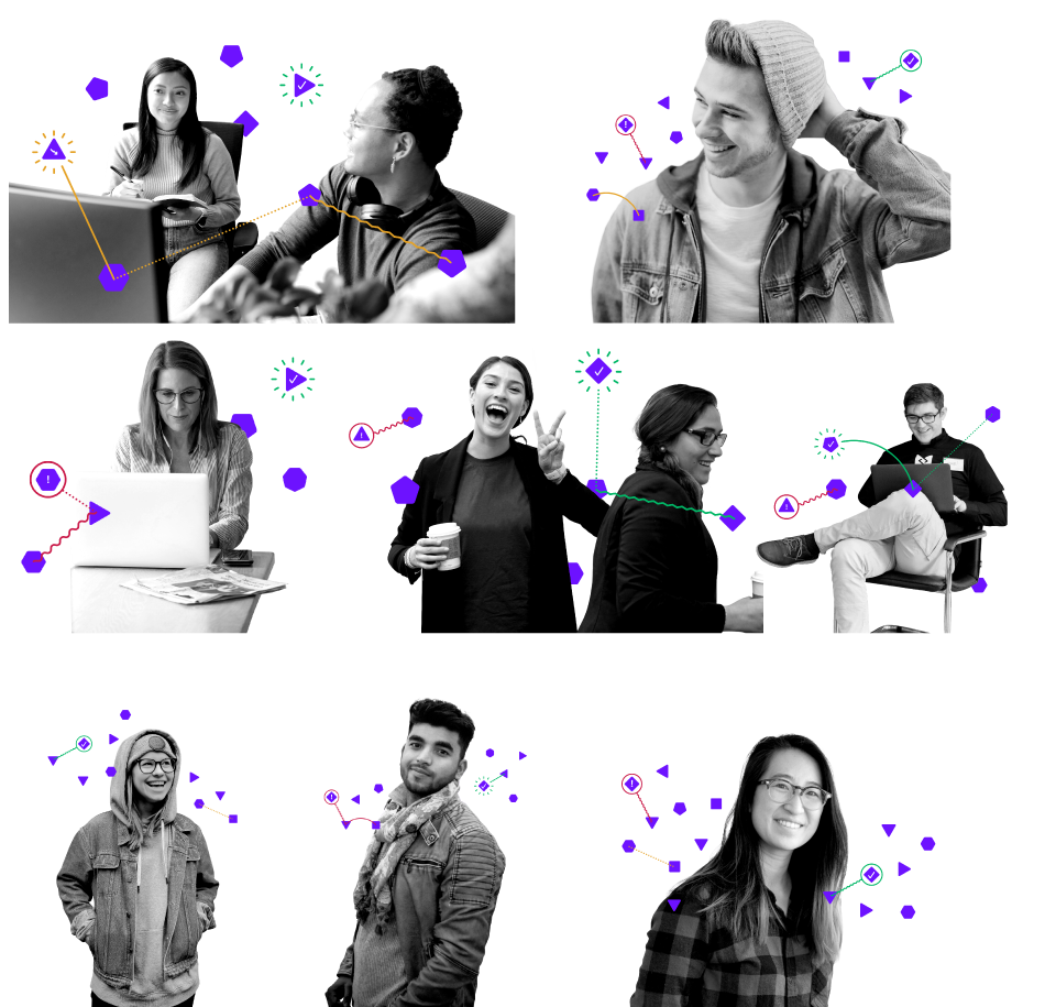
Icons
A selection of icons are available to illustrate the key features and benefits of Galvia. They are available to download in a range of colour and file formats.
Get our iconsConcept images
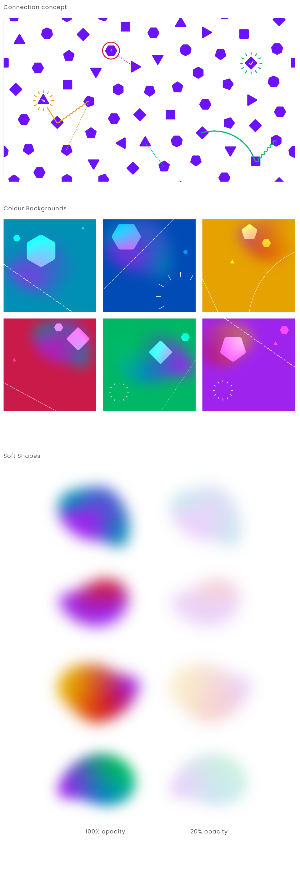
How we reveal the story of our user's data has been visualised in a library of concept images. Each image is composed of these elements; Nodes, Connectors, Status indicators and Soft Shapes. Data is represented by nodes, with Galvia revealing the story of that data in connection lines, highlights and status indications. The library of artworks is available to download in a range of formats and styles to express this concept.
Follow these principles when working with our concept images:
- Nodes never overlap.
- Connection lines, highlights and status indicators should always be drawn as simple, clean lines (continuous or dotted) at the same scale and thickness as illustrated here.
- Soft Shapes can be used in full saturation, or when placed within a whitre background, they can be tinted at 20% opacity.
Language
The following are some principles to inform your language when writing about Galvia.
- Numerals from one to nine should be written as words e.g. 'seven'. All other numerals should be written as numerals e.g. '12'or '150'.
- Include thousand separators in large numbers e.g. 1,299.
In action
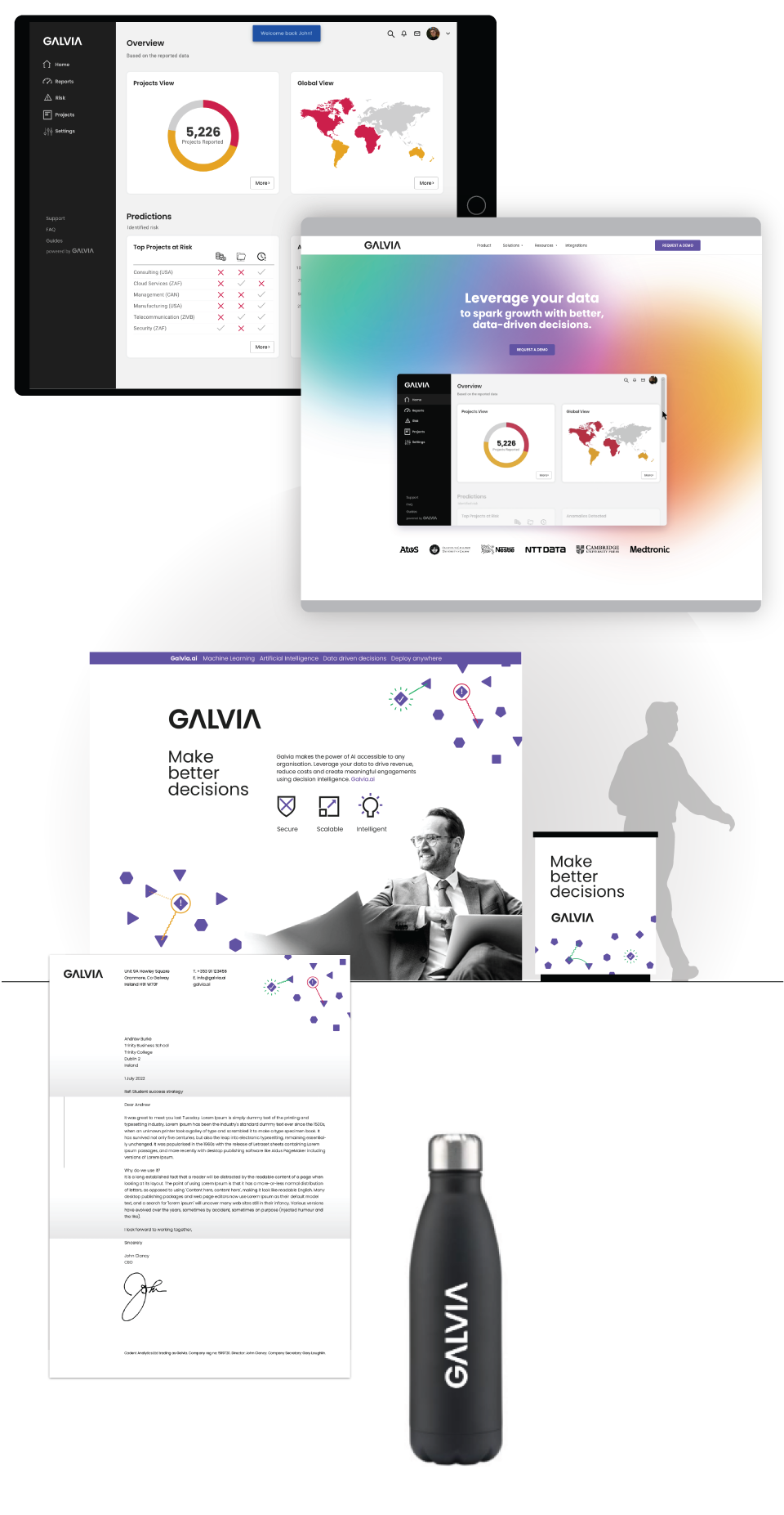
These images will give you a sense of how to bring it all together.
